Visualizing data as representation, lens, and space
Graduate Investigation
Data Environments
North Carolina State University
2015
Data. Is. Everywhere. It influences our relationships, the information we consume, the decisions we make at work and play. By exploring how we can tell lies with data, we prove the urgency for designers to maintain integrity when visualizing data.
Summary
This investigation explores how data can be manipulated through different visualization and interaction strategies, such as color, space, and chart type. By mashing-up two data sets that were chosen at random I was able to prove that if you manipulate a data set enough, we can make data say almost anything. The patterns and relationships that emerge may or may not be a true reflection of the data structure or events captured.
Process
This investigation broke down two disparate data sets between 2007 and 2013: cash receipts for agriculture commodities in the state of North Carolina and SAT scores from high schools in North Carolina.
I focused on counties that were on both ends of the rural-urban spectrum, as defined by the U.S. Bureau of Labor Statistics’ Rural-Urban Continuum Codes (RUCC) — codes are calculated by population, degree or urbanization and adjacency to a metro area. I extracted counties with the lowest RUCC (most urban) and counties with the highest RUCC (most rural) to come up with the 32 counties in this visual study.
Various methods for visualizing data were explored, from traditional scatterplots and histograms to layered parchment papers and XYZ coordinate planes. Three forms emerged from this investigation:
- data as representation explored how data is represented as literal, 2D visualizations
- data as lens explored how data can be used to construct a 3D form, and how light and space become variables that affect our interpretation of data
- data as space explored how data can be represented as an interface that can be experienced, giving rise to a 4th dimension — time and sequence — that affects our interpretation of data
Conclusion
Sometimes it's not the visible data that's important; it's what the data is not saying. If you push and pull data enough, you can get it to say almost anything. Be critical of the story you tell with data, be mindful of the variables you employ when representing data, and check biases when making design decisions.
Instructor: Dr. Deborah Littlejohn
Data Sources: U.S. Department of Agriculture, U.S. Department of Commerce, Public Schools of North Carolina, U.S. Bureau of Labor Statistics
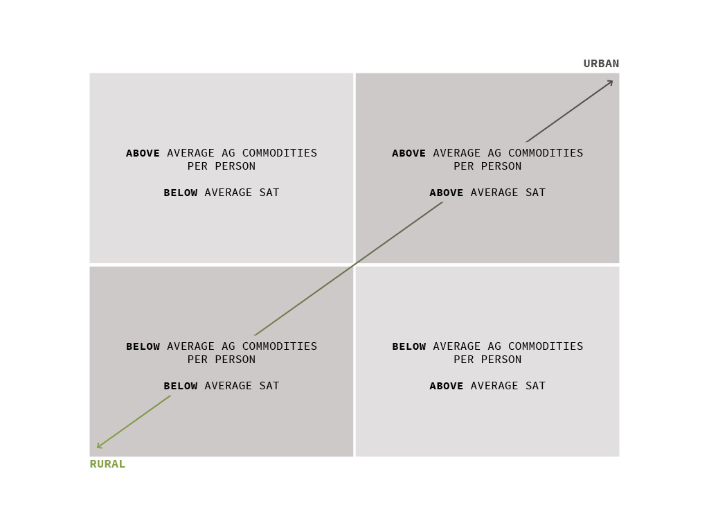
Data was interpreted and broken down according to three variables: quantitative, qualitative and spatial.
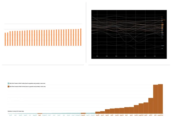
Data as representation: plotting mean SAT score against a county's rural or urban classification.
Data as representation: mapping parts of a whole against average dollars of agricultural commodities.
Data as representation: charting points above and below the mean, while layering average dollars of agricultural commodities per person in each county.
Data as lens was inspired by standardized Scantron sheets and images of aerial crop photography. By layering lasercut sheets of parchment paper with histograms of mean SAT scores and crop yields, values are less clear. The interplay of space and light exposes the layers of meaning beneath numbers.
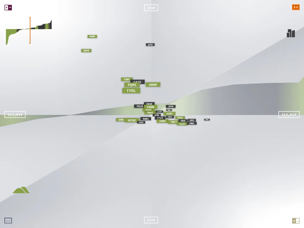
Data sets were mapped onto an XYZ plane, which established rules for an interface.
Data as space: prototype of the 4D interface.
"They [interpretive data mappings] bring to light the undemocratic nature of maps by asking: what gets missed in our preoccupation with top-down, scientifically accurate measurement?"
Janet Abrams and Peter Hall, Else/Where Mapping: New Cartographies of Networks and Territories


